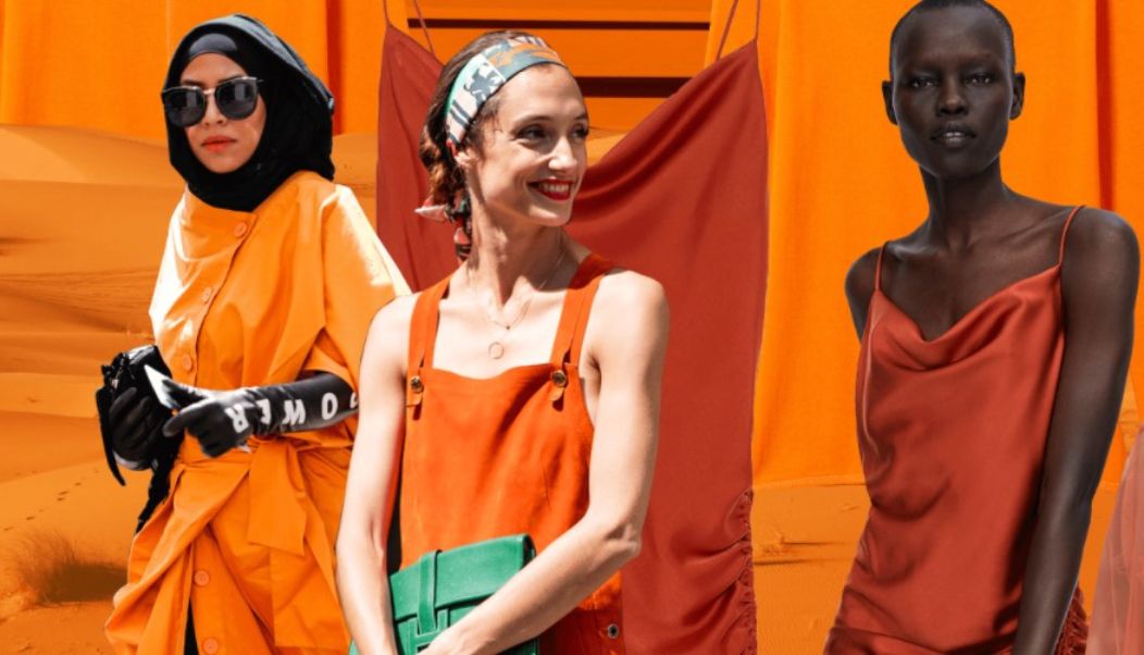
There is a longing for life, for joy, for colour in these unsettling times – and orange should stand for this feeling in the fashion summer 2021. This is how you wear the colour trend.
The joy of life, optimism and vitality – hardly any other colour has such a signal effect as orange. And that’s why the glowing tone is also in fashion right now.
The well-known Pantone colour institute has even included two shades of orange in its fashion colour trends for this summer: “Marigold” is the name of the orange with a golden undertone, “Orange Ocher” is a variant with a more brownish tinge. Together with other bright colours, they address our “longing for the carefree joy that comes into our lives through colour”.
But, also speaking from a fashion point of view, orange is always a difficult colour. It shines strongly and noticeably, after all, it is also considered a warning colour. Here it depends on the right combination – three tips from fashion experts:
Showcase orange with even more colour
The eye-catching mixture: Orange can be used wonderfully if you want to stand out fashionably. And that succeeds “especially in combination with other bright tones”, explains Maria Hans, stylist from Hamburg.
She advises giving orange a warm pink or bright apple green on the side. The haute couture brand Valentino has brought a previously unusual colour combination into play for this summer. At the shows for the season, she presented orange to a lilac shade on the catwalk. And delicate pink – by the way, the second big trend colour this summer – is a trendy option with orange.
Orange to orange – that fits
The exciting mixture: Orange can also be worn tone-on-tone, “because orange comes in many, very different versions,” says fashion consultant Milena Georg from Ulrichstein (Hesse). From a papaya-orange to tangerine to a red-orange.
With such monochrome outfits made up of several tones of one colour, you create tension by combining fabrics with different structures, explains Milena Georg. For example, a top made of silk with a skirt made of linen. Because with materials with a coarse structure, a colour appears more subdued, with smooth fabric, on the other hand, it looks brighter – so there is a nice play with contrasts.
Eyecatchers to neutral partners
The subtle mix: If you want to cushion the effect of orange, you will find good combination partners among the so-called neutrals – “that is, neutral tones such as grey or pastels such as light blue,” explains Maria Hans. “These tones should not be chosen for the top, but for the bottom, i.e. for a skirt or trousers, because orange gives the skin a warm tone.”
When toned down, the fashion colour orange is also best for those outfits that you have to wear to work in conservative companies. The shopping advisor Ritchie Karkowski from Timmendorfer Strand recommends combining it with sand, persimmon and a classy dark blue. “In addition, you shouldn’t necessarily use a particularly bright orange for the job, but rather a more subtle variant.”
A nice example of a piece in an office-grade orange is a blazer – these are currently more common in stores. A cream-coloured top goes well with it. Just a touch of make-up, fine shoes and also little jewellery complete the styling, says Karkowski.
A subtle way of wearing orange is also a summer dress in which the colour only appears in the pattern, or via accessories such as eye-catching earrings.

